
Communication
Branding and Visual Identity Systems
Completed / Built / Individual Participant

Architect / Designer:
Studio:
Design Team:
Country:
Ampersand is an independent publishing house founded in Buenos Aires in 2012, dedicated to books on writing, culture, and fashion. In 2025, they invited our studio to rethink their visual identity, which they felt had become disordered and not strong enough. At the same time, they were determined not to compromise their reputation or the recognition they had built over the years. They needed to remain who they were — only more visible, less solemn, and more powerful.
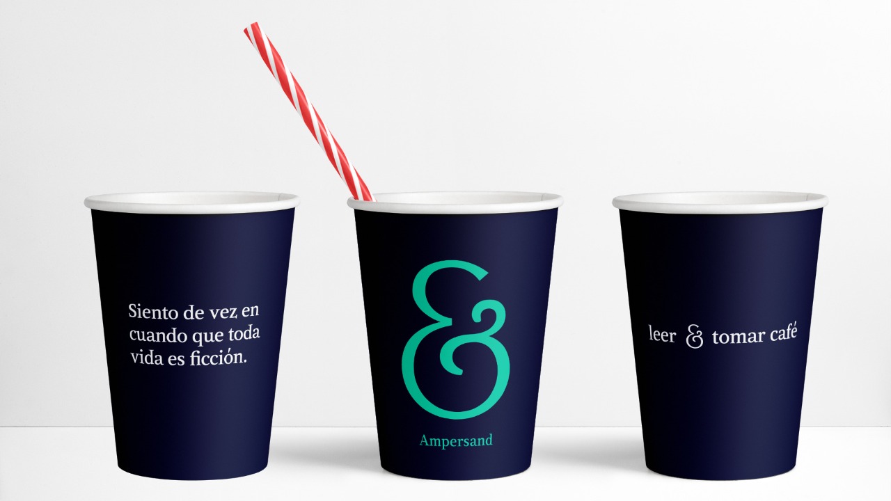
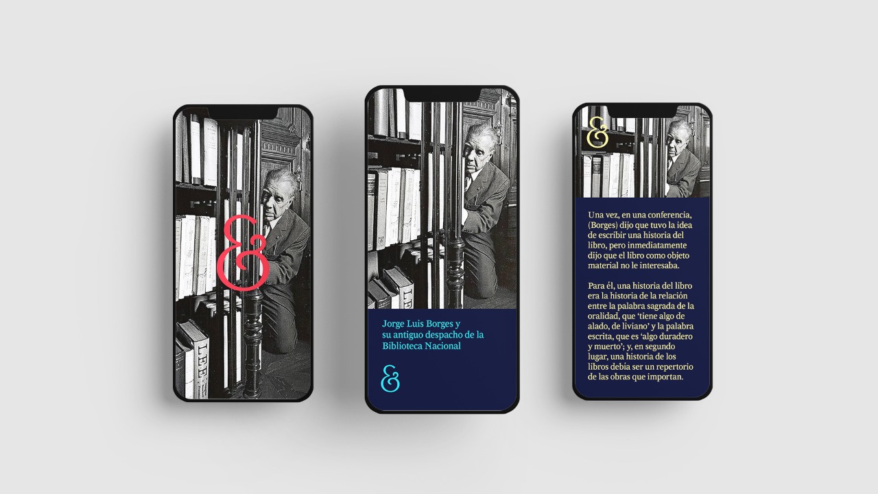
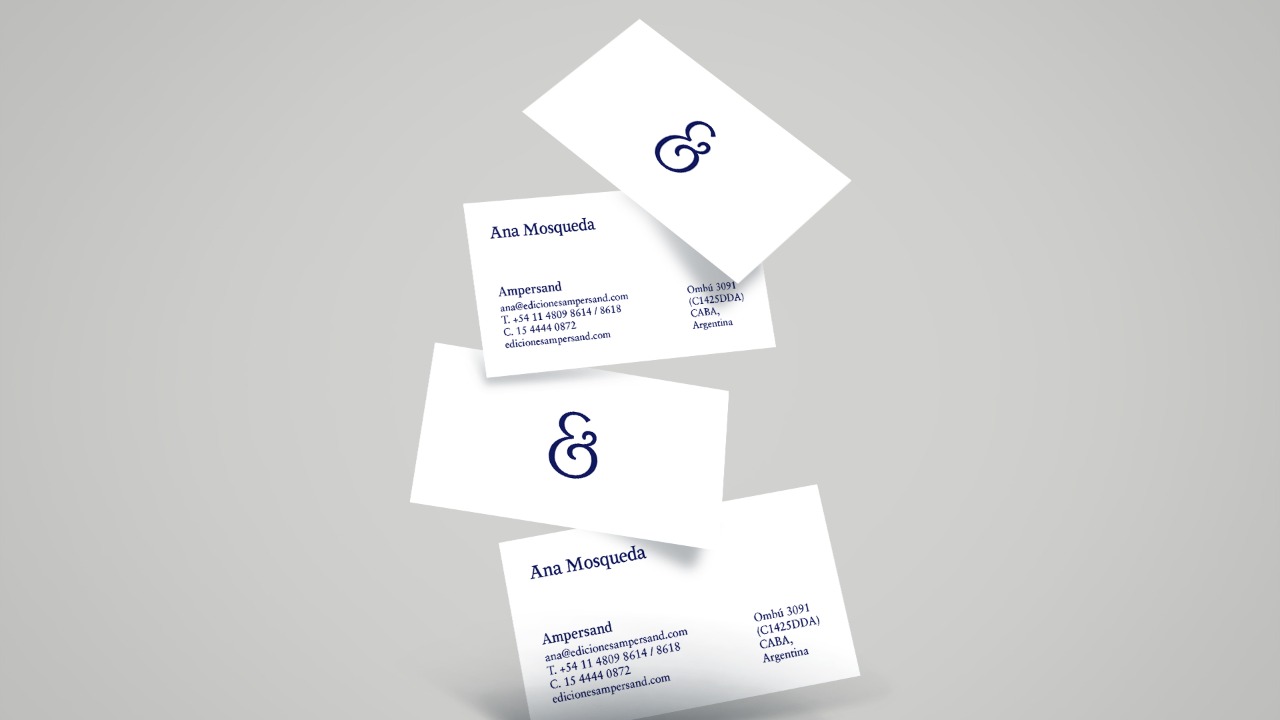
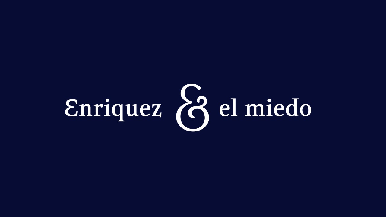
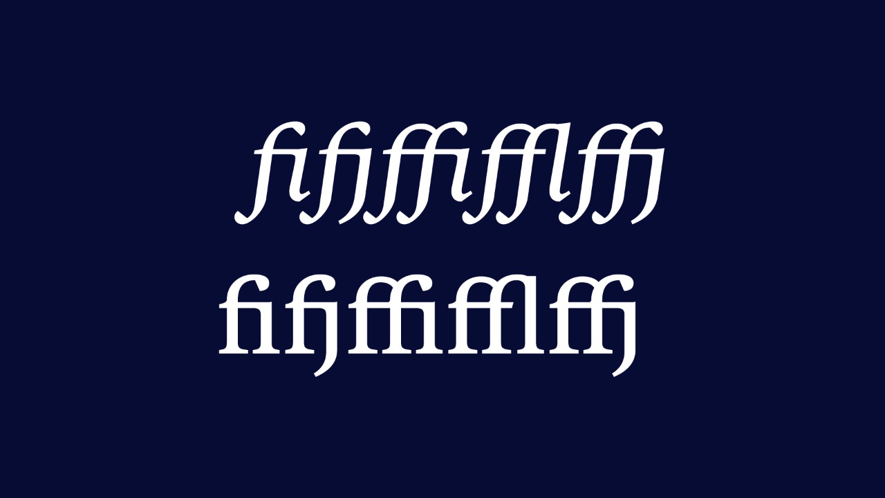
The rebranding focused on redefining their core identity elements. We redrew the logotype and symbol to improve formal quality, consistency, and functional performance, and we established a clear system for layout, imagery, and color usage. A key proposal emerged early in the process: the design of a custom typeface. For a publishing house devoted to writing, creating their own letterform system was not only coherent but deeply meaningful, allowing the identity to express their voice in a direct, typographic way.
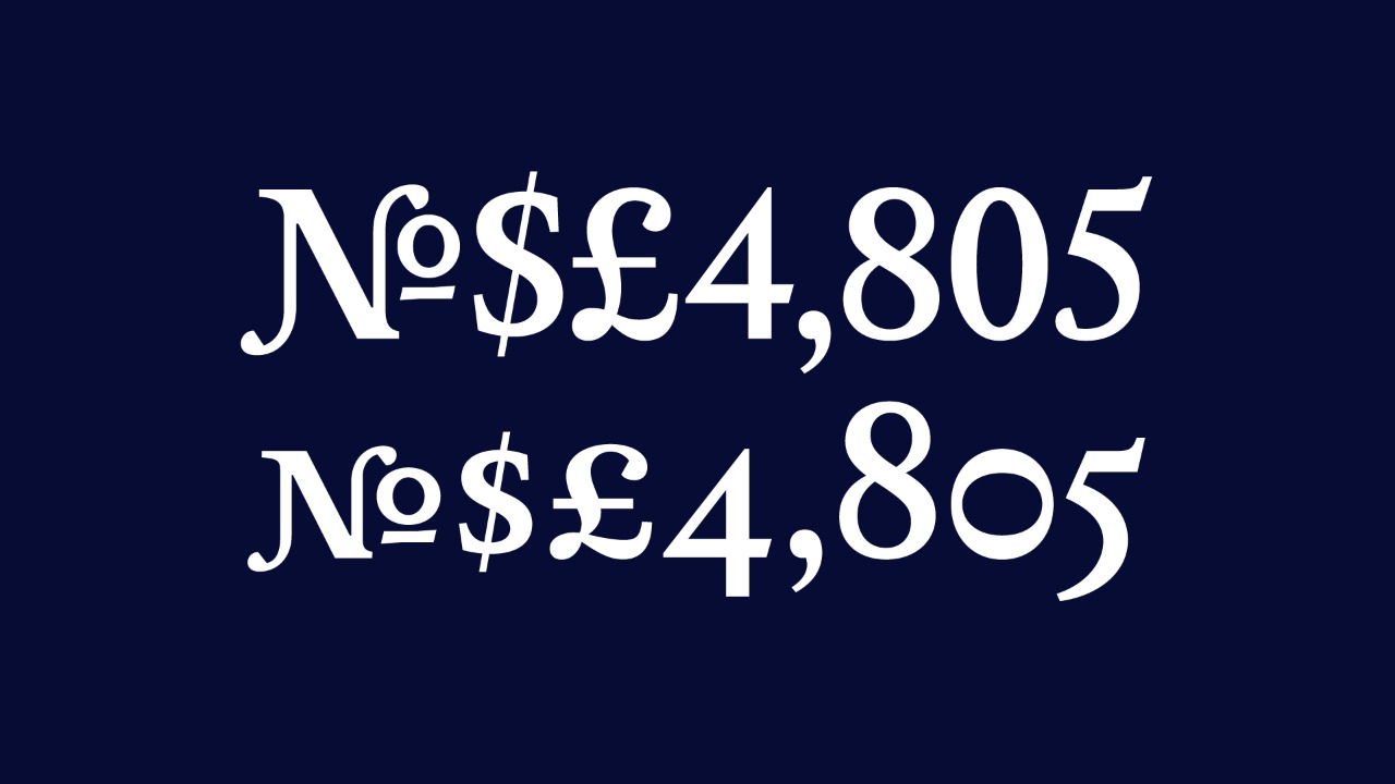
To develop this typeface we designed a display font family with enough distinctiveness to sustain institutional recognition. Its core inspiration came from Ampersand’s own emblem — a singular ampersand with voluptuous curves and sharp cuts. The resulting Roman and Italic styles each include more than 670 glyphs and support 38 languages, an essential feature for a publishing house of this scope. Conceived not for long immersive reading but for headlines and highlighted text, the typeface displays unexpected, sometimes audacious gestures that reinforce both uniqueness and character.
Martín Gorricho — Omnibus-Type
Martín Gorricho is an independent graphic designer from Buenos Aires with a long trajectory in identity design for cultural institutions. He has led high-profile branding projects for museums, festivals, and cultural organizations, and his work has been recognized internationally with awards such as the Excellence Award of Communication Arts and the Argentine Good Design Seal.
Omnibus-Type is an Argentine type foundry established in 2011 by Pablo Cosgaya, Héctor Gatti, and Marcela Romero, focused on crafting high-quality typefaces for print and digital use. Their catalog includes widely used and respected families such as Chivo and Asap, and their designs are distributed through platforms like Google Fonts.
This is not the first collaboration between Gorricho and Omnibus-Type: they previously developed the visual identity and custom typefaces for the Museo de Arte Moderno de Buenos Aires, a project that received significant international recognition.
Your privacy settings
Manage Consent Preferences
Necessary
Analytics
Embedded Videos
Marketing
Facebook Advanced Matching
Facebook CAPI