Communication
Branding and Visual Identity Systems
Completed / Built / Individual Participant

Architect / Designer:
Design Team:
Copyright:
Country:
Public School 9, located on Manhattan’s Upper West Side, serves students from Pre-K to fifth grade. The school emphasizes the importance of a growth mindset and encourages exploration to help students achieve lifelong success. Celebrating PS9’s mission to nurture curious students who embrace uncharted territories, the glass mosaic “Man in Space” by Vincent Cavallaro is proudly displayed in the PS9 auditorium foyer. Commissioned in 1963, the mosaic celebrates advancements in space exploration and reminds students of the value of science and discovery. While PS9 has always been very clear on who it is and what it stands for, it lacked a cohesive brand identity that communicated these values to a wider audience.
The challenge was for PS9’s new visual identity to embody the spirit of exploration while still standing strong as an academic institution first and foremost. The visual identity needed to resonate with parents, teachers, and students alike. Making the brand feel youthful and fun yet academic and reliable was a delicate balance to get right. Another key element to consider was ease of use: The people who would be taking on the brand identity and creating new materials were teachers who were busy with their classrooms and tight schedules. They didn’t have time to fuss over complex layouts or a convoluted type system. As a result, the new PS9 brand needed to be clean and impactful.
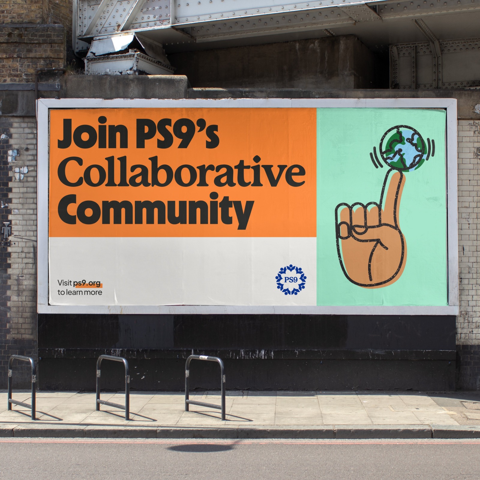
The new brand identity for PS9 is anchored in a simple grid system. This not only creates a strong framework for easy use of the brand system, but also evokes a sense of structure and academic authority, essential aspects of the PS9 brand. Building off of PS9’s encouragement of exploration, illustrations celebrate the imperfect: The outline and fill are slightly offset to create an intentional misprint effect. Custom patterns add another layer of playfulness to the brand. The brush styles used to make the patterns reference materials one would find in a classroom. These patterns, illustrations, and the vibrant color palette evoke whimsy, while strong typography and uncluttered layouts highlight PS9’s commitment to academic excellence.
The type system also embodies the two facets of the PS9 brand by alternating between two headline fonts: An academic yet approachable serif, Mackinac by P22, is combined with a bold and fun sans serif, Nichrome by Mass-Driver. Nichrome was the perfect choice of a bold sans, because it was designed to reference typography in 1970’s/80’s sci-fi paperbacks and thus acts as another subtle nod to the PS9 space mosaic. All these elements come together to create a simple yet striking brand identity for PS9, reflecting its core values and giving it a strong, confident visual presence within the community.
Your privacy settings
Manage Consent Preferences
Necessary
Analytics
Embedded Videos
Marketing
Facebook Advanced Matching
Facebook CAPI