Design Skill Awards / 2026
Branded Content
AWARDED NOMINATIONBest Branded Packaging Design
The Foodie Bar
Discover the projectBehind the distinction.
✓ Verified winner · DESIGNSKILLAWARDS-6F1192C85B22083A
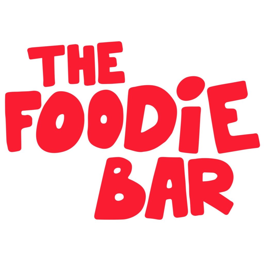
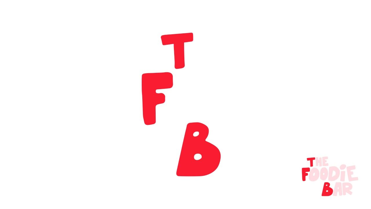
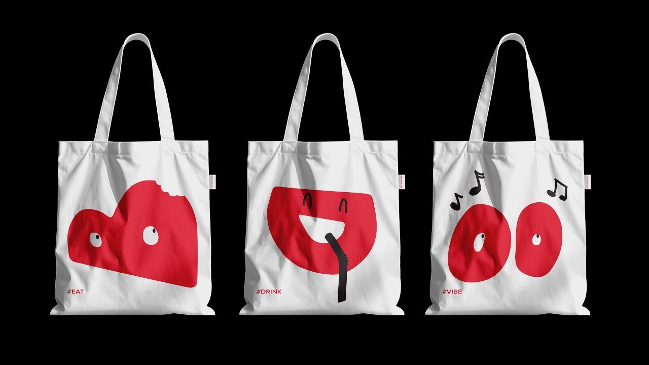
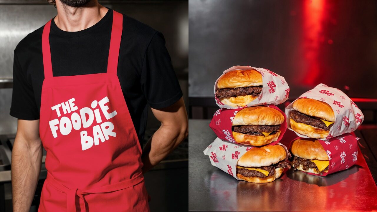
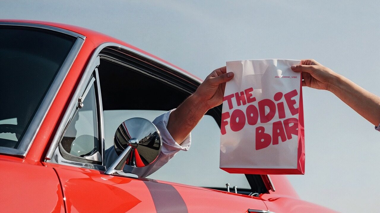
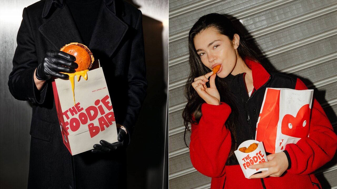
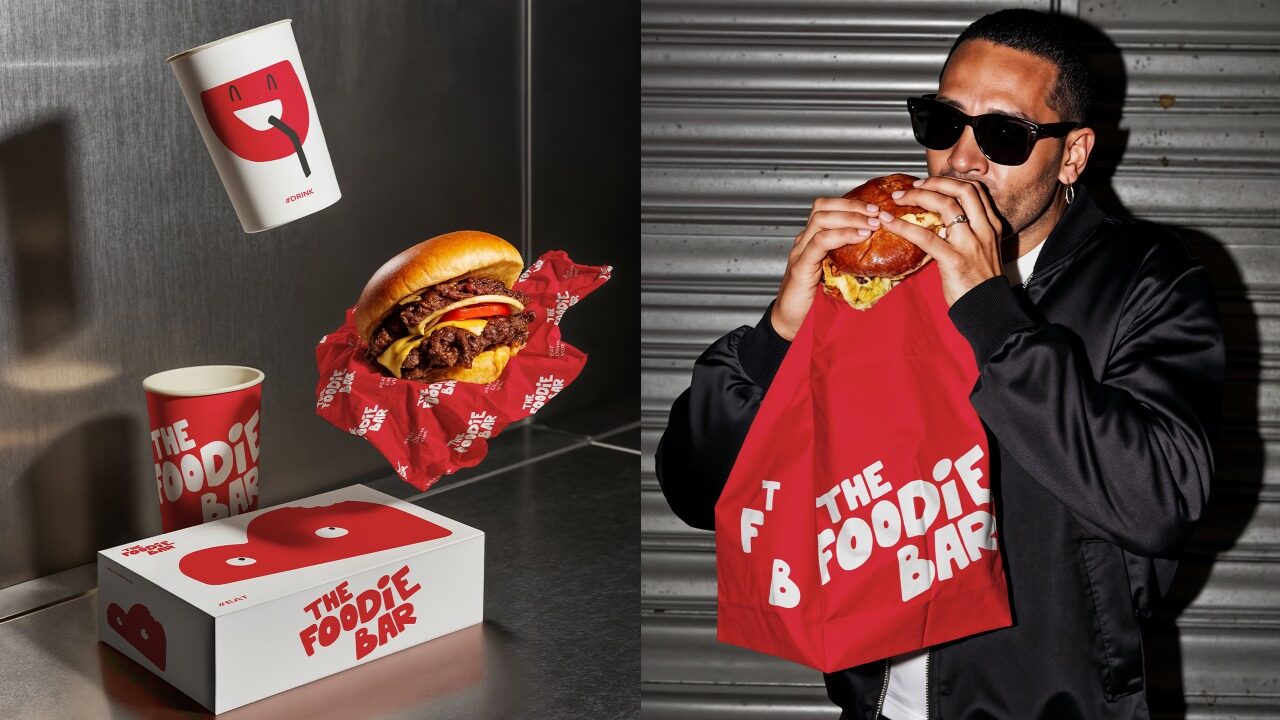
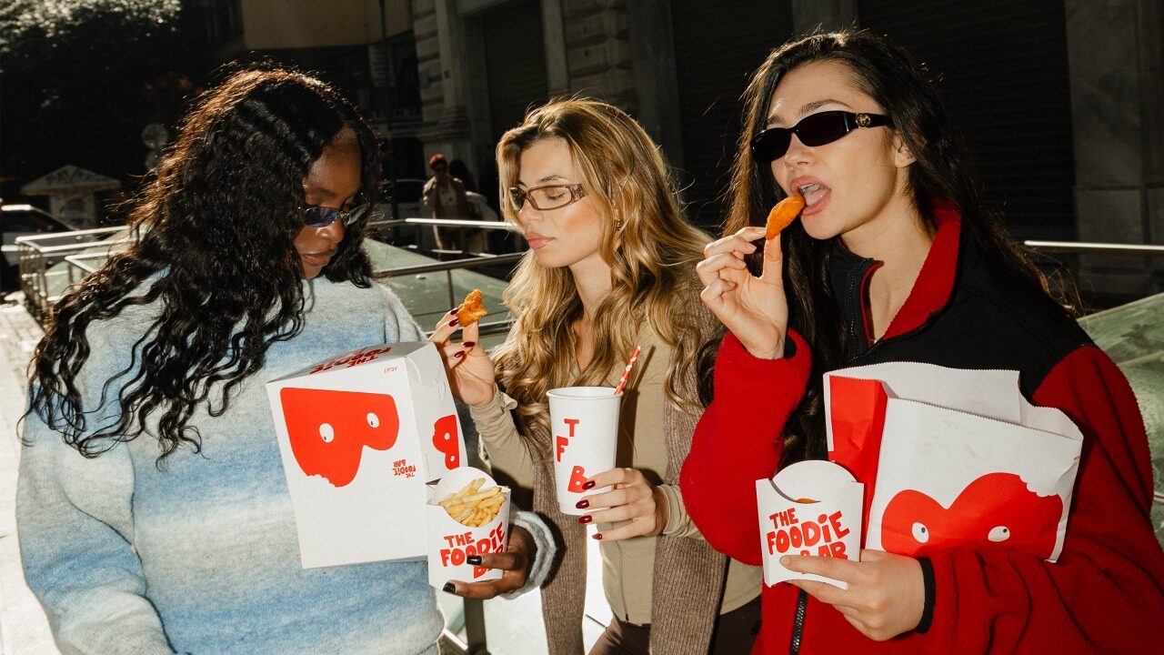
The Foodie Bar is a casual food restaurant with drinks and music. It is a social space where the experience is shaped as much by rhythm, movement, and atmosphere as by what is served. The brief was to design a visual identity that would not function as a static logo, but as a living system capable of expressing street food culture, music, and collective enjoyment in a direct and confident way. The creative strategy was built around the idea of the logo as an organism. From the outset, the mark was designed to carry energy and motion, behaving less like an emblem and more like a performer within the space. The identity avoids decorative food clichés, focusing instead on attitude, presence, and immediacy. Typography plays a central role. The custom letterforms are bold, rounded, and expressive, with a controlled irregularity that suggests movement, rhythm, and physicality. Letters appear to melt, shift, or dance, echoing the dynamics of street food, late nights, and shared moments. Red was selected as the core colour of the system. Associated with appetite, intensity, and impact, it establishes a strong visual signal. Paired with white, it creates a clear, high-contrast language that remains powerful across scales and applications. The reduced palette allows form and behaviour to carry the identity. The logo was designed as a modular system with a fixed structure. The initials TFB can break apart and reassemble, always returning to the same composition. This allows the identity to be recognisable even when the full logotype is absent: seeing TFB is enough to identify The Foodie Bar. The system adapts seamlessly across packaging, bags, cups, wrappers, apparel, and everyday objects without losing coherence. Scale and placement are used assertively: oversized applications, cropped forms, and active negative space ensure the logo dominates rather than decorates. The tagline “Eat. Drink. Vibe.”, which we created, operates as a design rule rather than a slogan. It defines the tempo of the system and guides every visual decision. The identity is recognisable from a distance, and experienced through use. It’s a visual system that moves with the brand, the city, and the people who carry it.
A.S. Strategy, Branding & Communication
For over 35 years, our agency has evolved through curiosity, intuition, and a constant desire to stay creatively young. We are a multidisciplinary team of ten distinct personalities united by the belief that creativity can shape culture, perception, and human experience. Our approach combines strategic thinking with emotional insight. Before we analyse a product, we sense its aura and understand the feeling it creates. We believe every idea reflects a position on life and every client deserves a unique approach. We take our work seriously, but never ourselves, building strong collaborations through trust, clarity, and adaptability. Driven by passion and supported by experience, we create identities and experiences designed to make a meaningful and lasting impact.
More winning work.
Explore all winners Platinum Winner2026
Nuromova N1 -A quiet wearable for mental sustainability in sport
Nuromova Technology Co., Limited
Best Wearable Technology & Smart Clothing
 Platinum Winner2026
Circonflex Montreal
Zébulon Perron for Circonflex
Best Workplace & Office Interior Design
 Platinum Winner2026
Paseo “La Corriente” – Urban Regeneration Project
INSTITUTO MUNICIPAL DE PLANEACION DE SAN LUIS POTOSI
Best Landscape Restoration & Conservation