
Design Skill Awards / 2026
Packaging
AWARDED NOMINATIONBest Food & Beverage Packaging
Eleology Early Harvest
Discover the projectBehind the distinction.
✓ Verified winner · DESIGNSKILLAWARDS-8AEC3E23C38DAF64
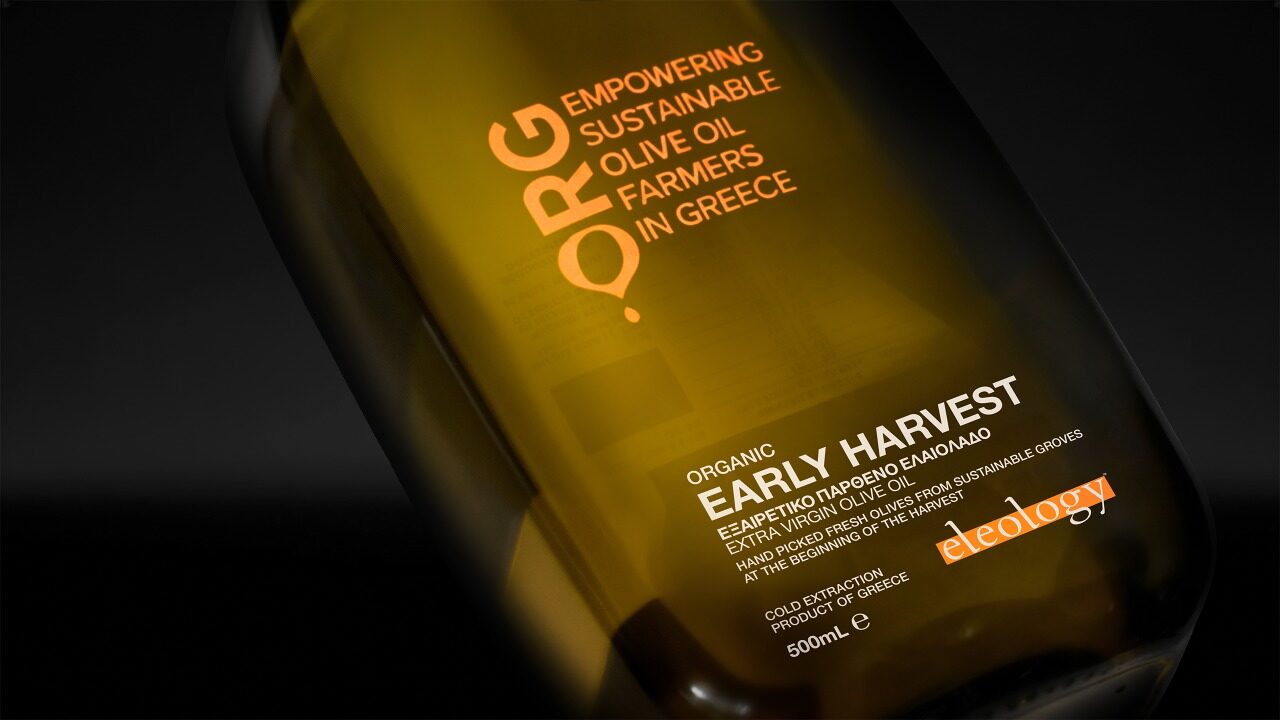
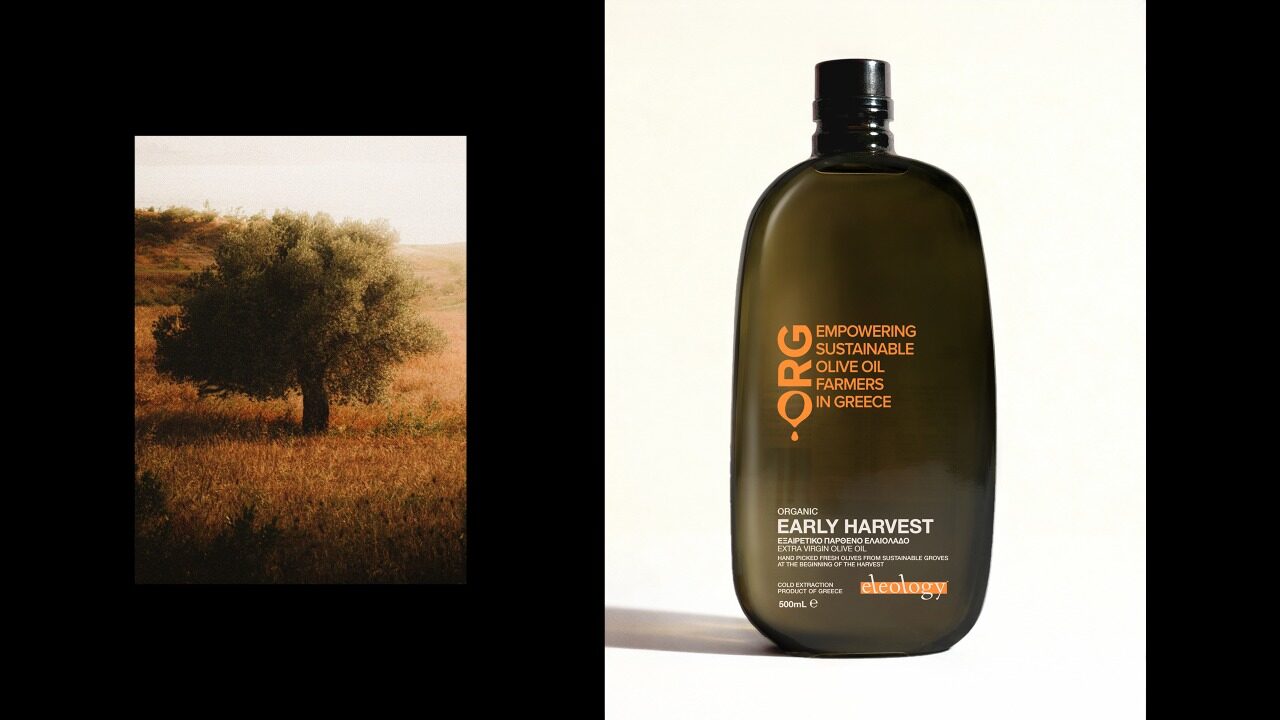
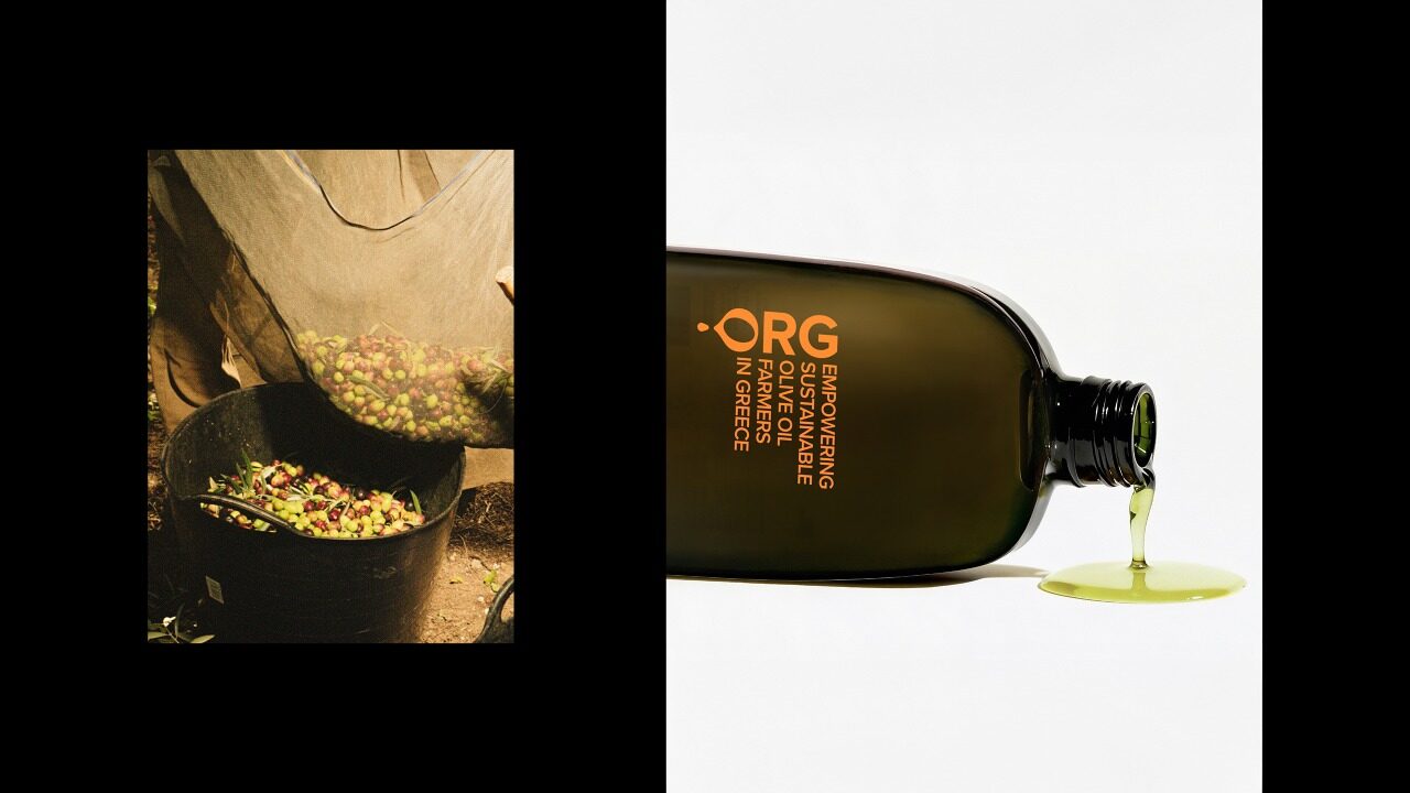
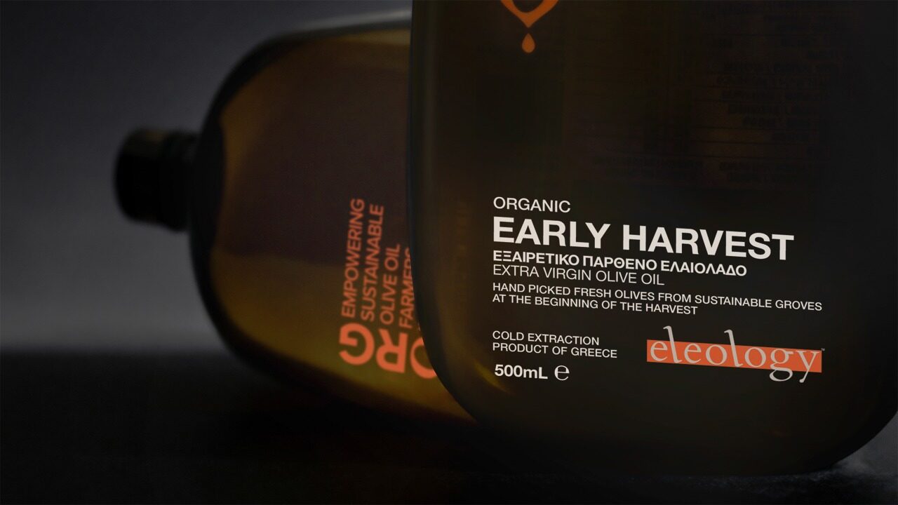
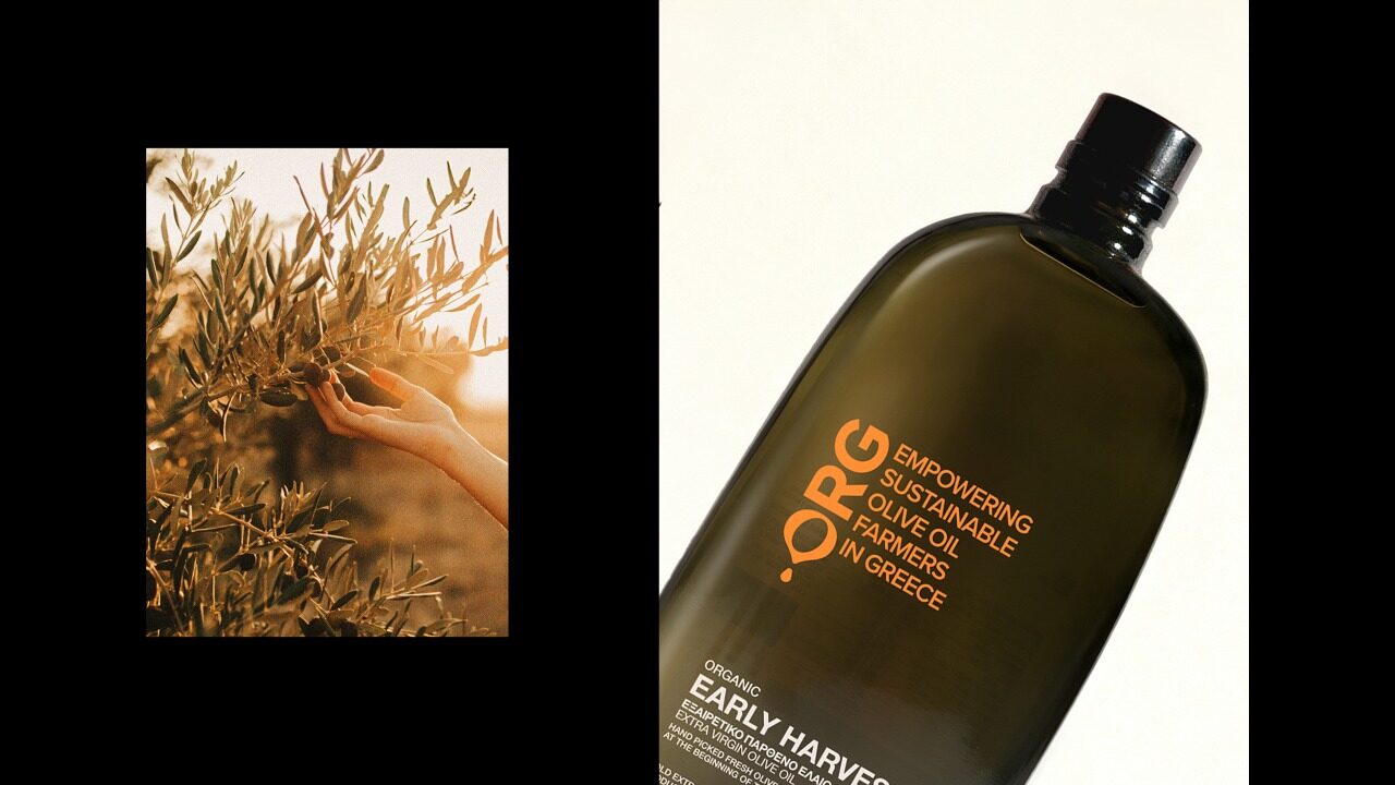
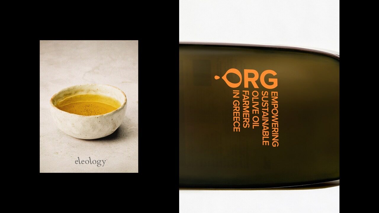
Eleology operates as an organisation rather than a conventional olive oil brand, actively supporting organic olive oil cultivation in Greece through transparency, sustainable practices, and long-term collaboration with independent producers. This organisational role is not a descriptor but the core of Eleology’s identity. Within this context, the objective for the Early Harvest packaging was not to introduce another premium label, but to make the organisation itself immediately recognisable. The challenge was to design a pack that clearly belongs to an org, not to a lifestyle brand, and to communicate structure, continuity, and collective purpose in a category dominated by emotional narratives and nostalgic symbolism. Early Harvest represents a premium olive oil collected at the very beginning of the harvest, when olives are not yet fully ripe. Rather than expressing this premium quality through ornament or visual storytelling, the design approach focused on clarity and structure. The phrase “Empowering sustainable olive oil farmers in Greece” was treated as an organisational principle rather than a slogan. Repeated and given typographic weight, it establishes authority and positions the pack as part of a larger system. The logotype reinforces this logic. The letter “o” becomes an olive from which a single drop of oil falls — a minimal but decisive gesture that connects organisational structure directly to agricultural reality. The organisation does not describe its role; it demonstrates it. Colour plays a critical differentiating role. In contrast to the dark, serious tones commonly used in premium olive oils, Early Harvest adopts a bold orange. This choice introduces contemporary energy, visibility, and immediacy, signalling an organisation in action rather than heritage on display. The bottle itself was consciously selected rather than custom-designed. Its sculptural, organic form, with no identical sides, straight lines, or sharp edges, echoes shapes found in nature. This natural irregularity balances the structural discipline of the label, reinforcing the perception of olive oil as ancient, natural, and precious. The result is a packaging expression that gives physical form to an organisation, not a product narrative.

 THE PEOPLE BEHIND THE PROJECT
A.S. Strategy, Branding & Communication
For over 35 years, our agency has evolved through curiosity, intuition, and a constant desire to stay creatively young. We are a multidisciplinary team of ten distinct personalities united by the belief that creativity can shape culture, perception, and human experience. Our approach combines strategic thinking with emotional insight. Before we analyse a product, we sense its aura and understand the feeling it creates. We believe every idea reflects a position on life and every client deserves a unique approach. We take our work seriously, but never ourselves, building strong collaborations through trust, clarity, and adaptability. Driven by passion and supported by experience, we create identities and experiences designed to make a meaningful and lasting impact.
More winning work.
Explore all winners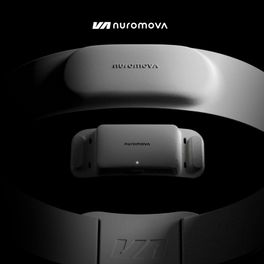 Platinum Winner2026
Nuromova N1 -A quiet wearable for mental sustainability in sport
Nuromova Technology Co., Limited
Best Wearable Technology & Smart Clothing
 Platinum Winner2026
Circonflex Montreal
Zébulon Perron for Circonflex
Best Workplace & Office Interior Design
 Platinum Winner2026
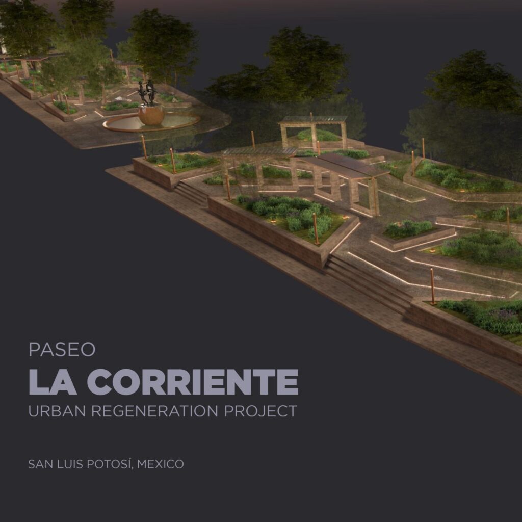
Paseo “La Corriente” – Urban Regeneration Project
INSTITUTO MUNICIPAL DE PLANEACION DE SAN LUIS POTOSI
Best Landscape Restoration & Conservation